A friendly face for Chile’s new pet marketplace
Brand identity for PAWTIO, an online platform that brings many pet stores together in one easy place to look, compare and buy.
At a glance
3
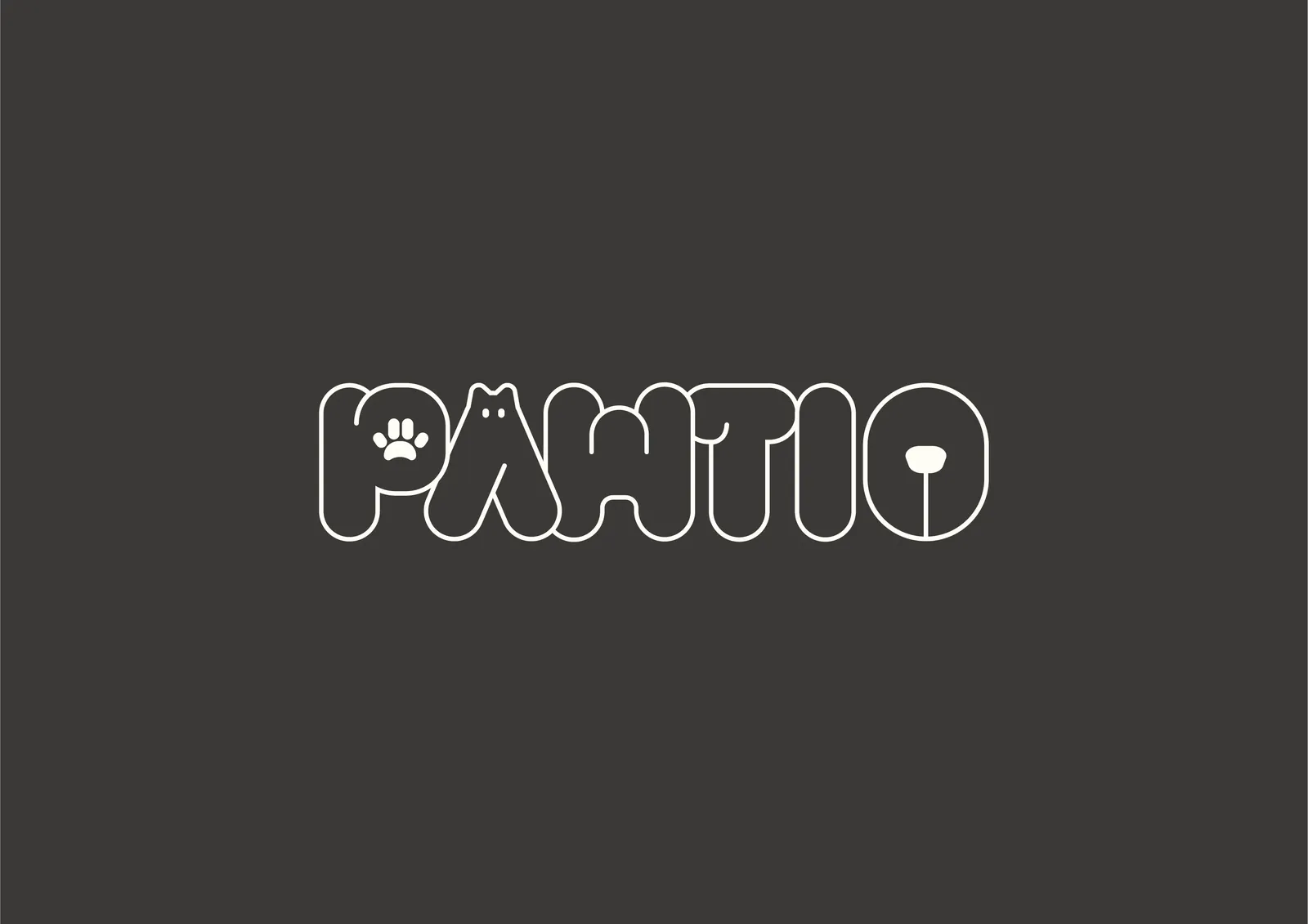
pets hidden in one wordmark: a paw, a cat and a dog
2
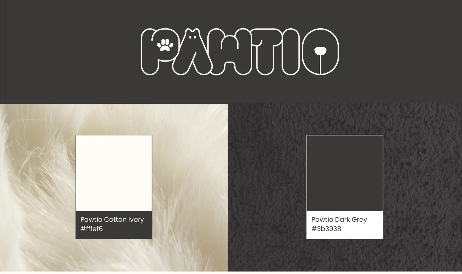
colours named after fur: Cotton Ivory and Dark Grey
1
slogan: “Paws, Play, Pawtio”
What we did
- Brand story
- Wordmark & symbol
- Colour & typography
- Pattern & visual elements
- Packaging
- Outdoor & vehicle graphics
The challenge
Pet owners in Chile were jumping between different websites to find, compare and buy pet supplies. PAWTIO set out to bring many pet stores together in one simple place.
As a brand-new marketplace, it needed an identity that felt friendly from the very first visit: welcoming to every kind of pet and owner, and clear enough to work as a store.
How we helped
- 01
Built the brand on its name
Pawtio mixes paw, the cute and friendly feet of pets and their fun side, with patio, the Spanish word for an open yard: an easy-to-reach, shared space drawn from Chile’s warm ways. A place where all kinds of pets can join in, more than just a store.
- 02
Hid the pets in the letters
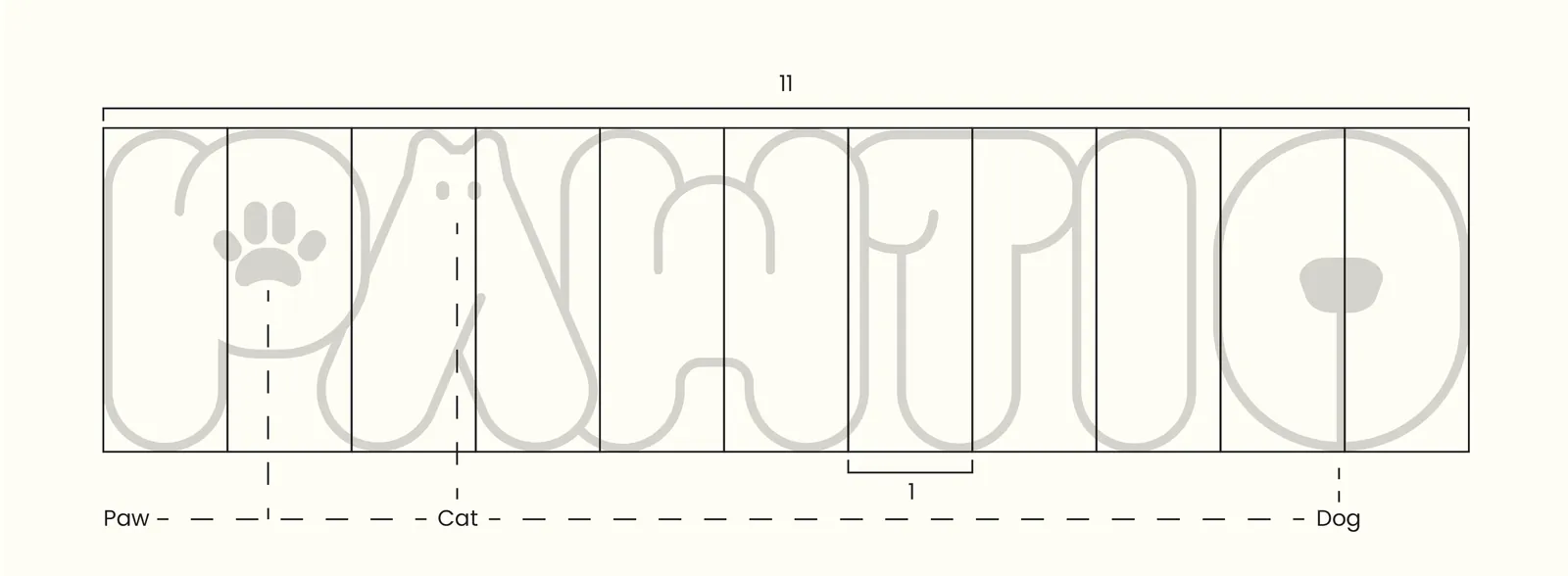
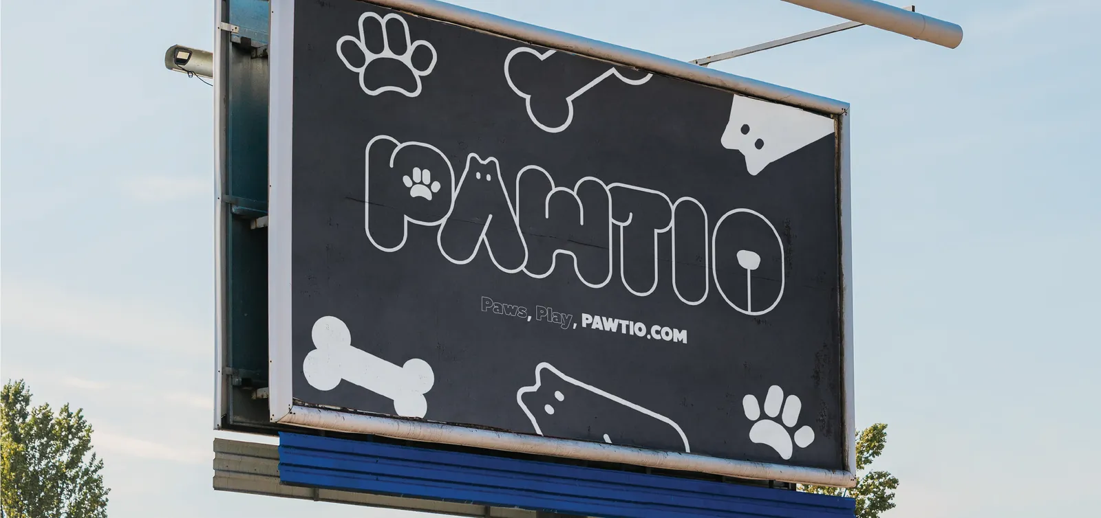
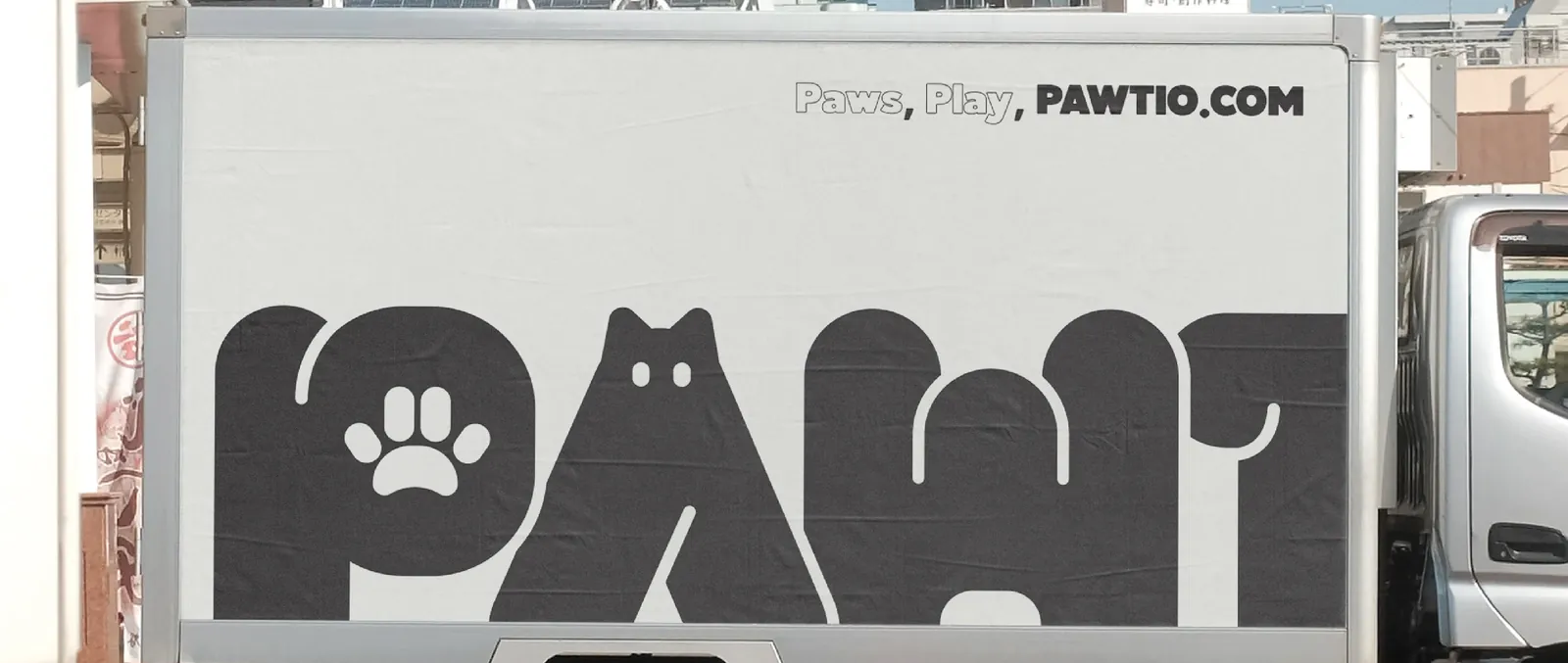
The rounded wordmark carries a paw in the P, a cat in the A and a dog’s nose in the O, drawn on an 11-unit grid. A P-with-paw symbol and a “PAW” sub-logo cover the places where the full name doesn’t fit.
- 03
Made it soft, simple and easy to use
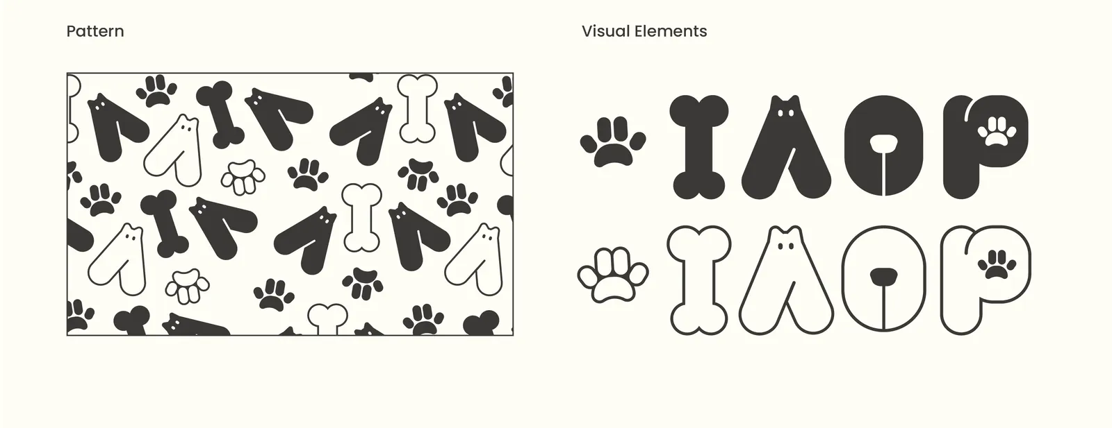
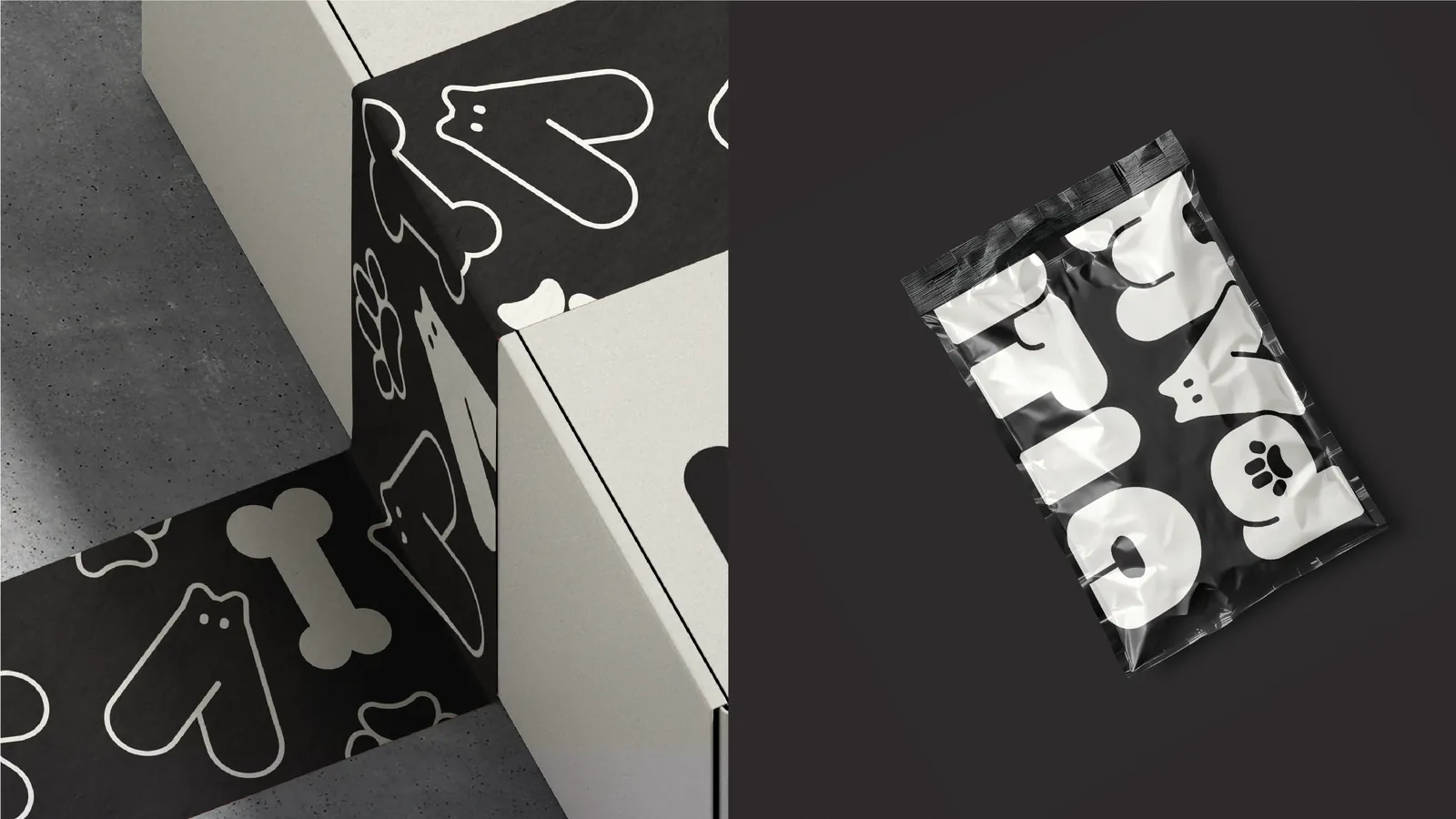
Two colours named after fur, Cotton Ivory (#fffef6) and Dark Grey (#3b3938), a bold title face (Atelia) with Poppins for content, and a pattern of paws, bones and characters that runs from shipping boxes and bags to billboards and delivery trucks.
The outcome
A complete, ready-to-use identity: logo system, colours, typography, slogan, pattern and applications.
“Paws, Play, Pawtio” sums it up: a fun, inclusive pet hub where animals and owners connect and enjoy, with a friendly face from the first visit to the delivery at the door.
Insights
Start from the name.
Paw plus patio already told the story: a friendly, open place for every pet. The identity only had to show it.
Hide the delight in the details.
A paw, a cat and a dog sit inside the letters, there for anyone who looks twice.
Friendly is a system.
Two soft colours, a rounded wordmark and one pattern carry the same warmth from the website to the delivery truck.
“My experience working with Sowol was so joyful! I contacted him so we can work a brand style book for a project i had in mind. And i have to say, from the beginning to end he asked the right questions, listen carefully and developed concepts and ideas with patience until we arrived to final form. It was smooth, and original!”
 Benjamin VasquezMaterlializate Spa