An identity that sounds like the band
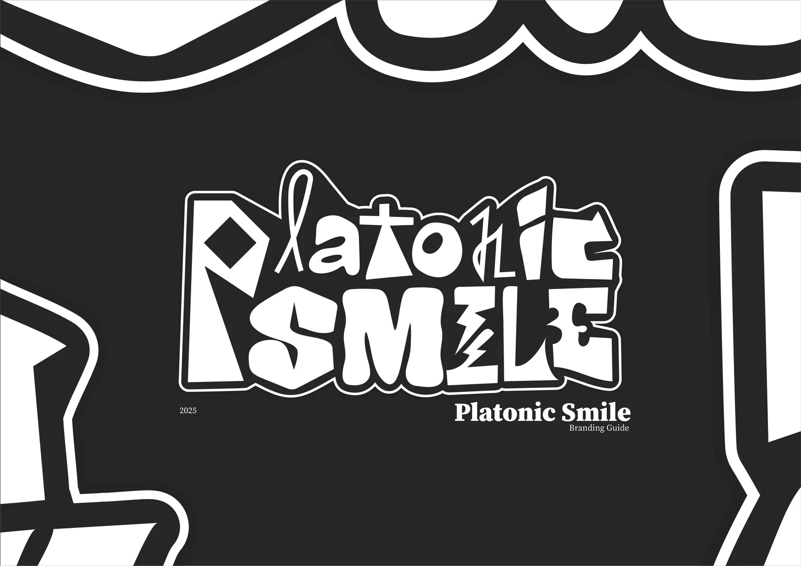
A brand identity redesign for Platonic Smile, an indie-rock band from the Netherlands, made to feel as honest, quirky and high-energy as their music.
At a glance
3
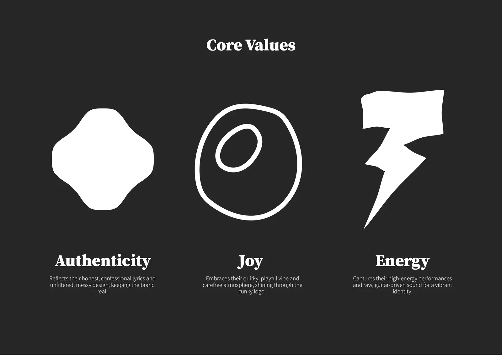
core values: authenticity, joy and energy
1
hand-cut wordmark, every letter its own
2
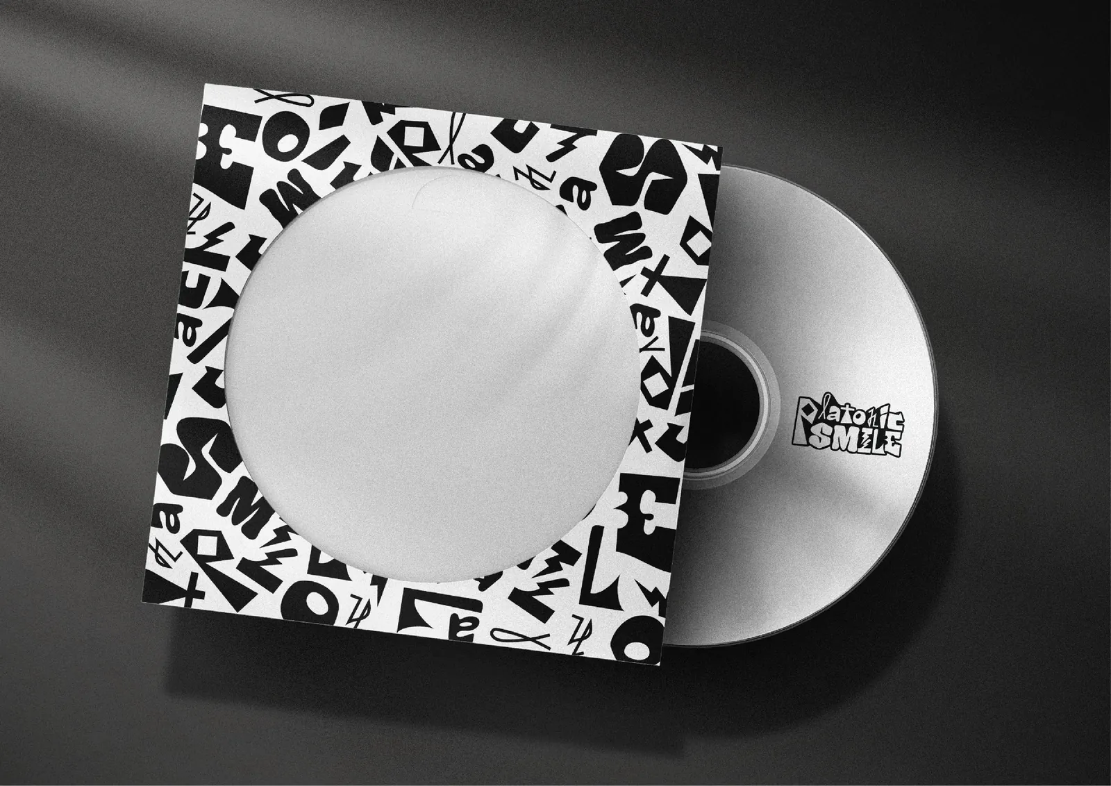
patterns made from its letters
What we did
- Brand values
- Wordmark
- Custom lettering
- Pattern system
- Typography
- Merch & ticket design
The challenge
Platonic Smile, formed in 2023, wanted to fill venues with cathartic energy and release an album. Their quirky, honest, high-energy personality comes through in candid lyrics and a sound that blends indie pop with raw, guitar-driven alt-rock.
Their logo was notable, but it didn’t fully reflect that vibe.
How we helped
- 01
Started from what the band stands for
Three core values became the brief for everything else, each with its own shape: authenticity for the honest, confessional lyrics; joy for the quirky, carefree vibe; energy for the high-energy shows and raw guitars.
- 02
Drew a wordmark with attitude
A funky, hand-cut wordmark with jagged lines and playful curves. Every letter is different, and together they make a band: flexible like the group itself, and brave like a new name on the indie scene.
- 03
Turned the letters into a toolkit
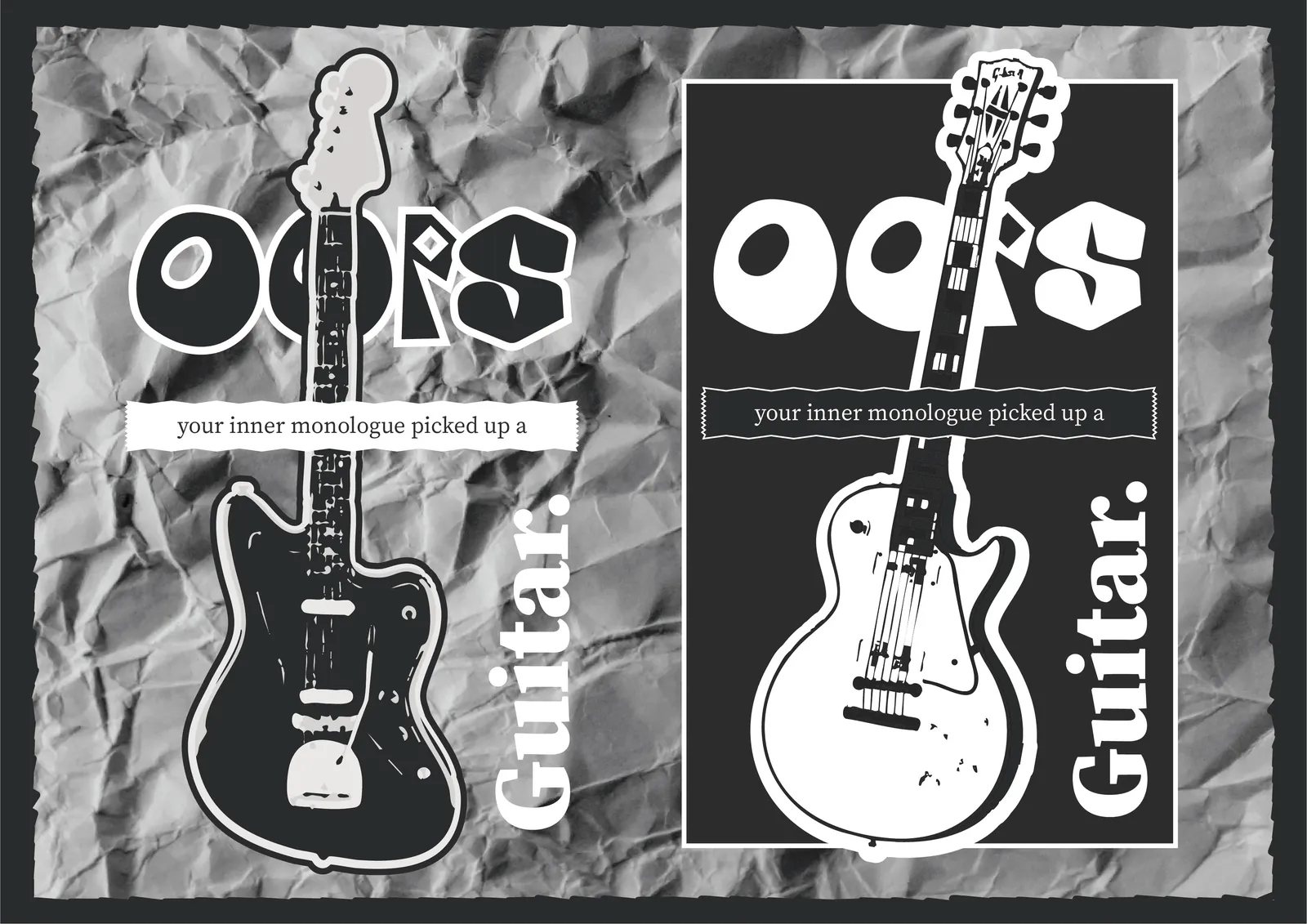
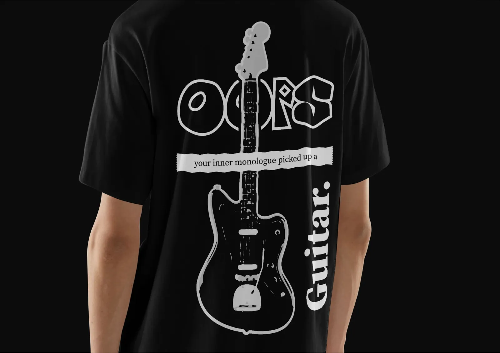
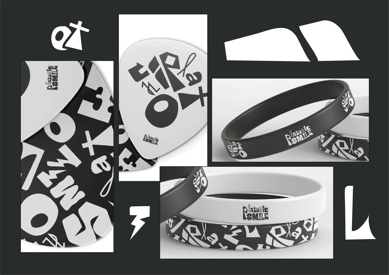
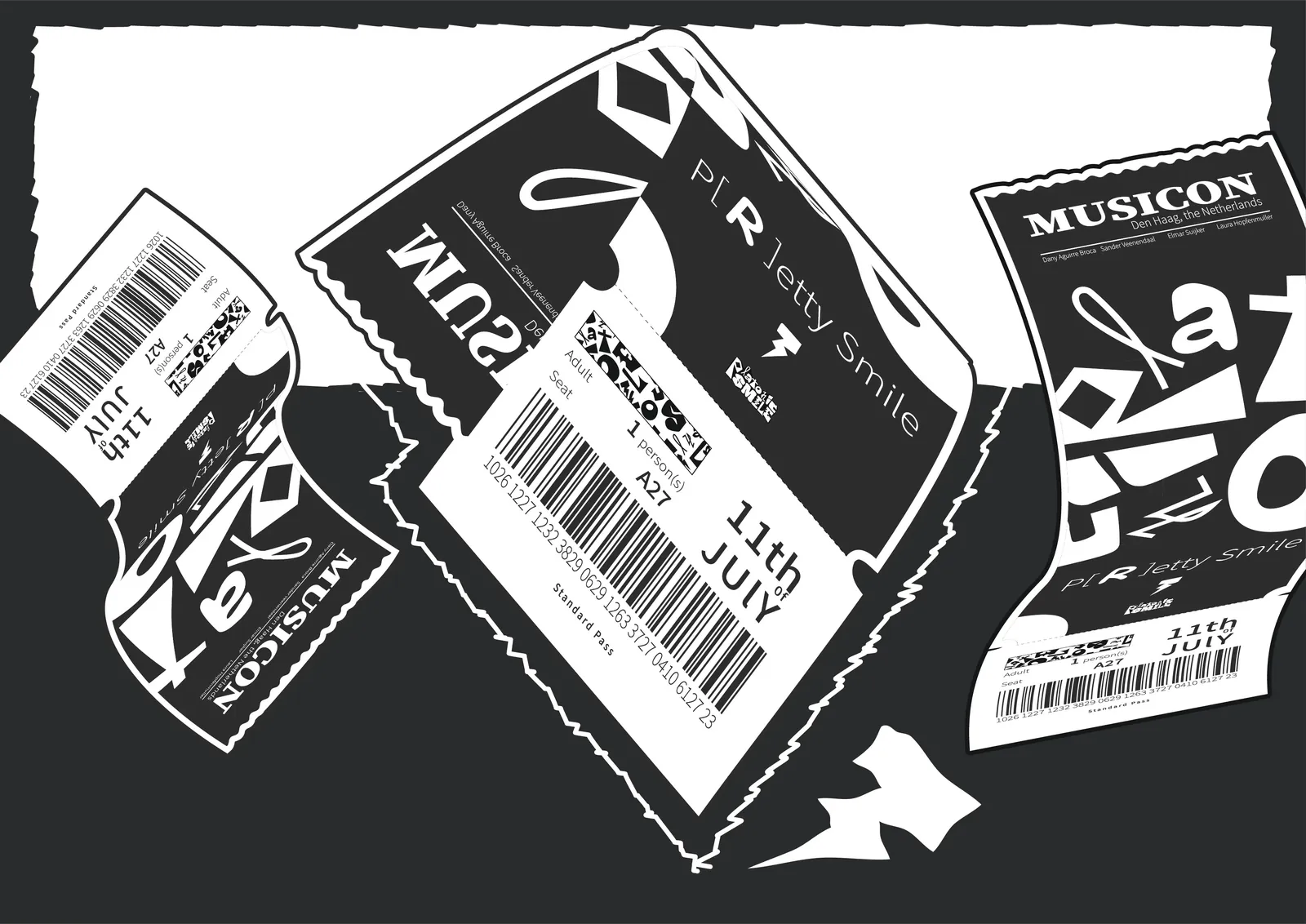
The letterforms became patterns and custom display lettering (“OOPS”, “atomic”). Paired with Source Serif and Noto Sans and a subtle paper texture, the system runs across posters, the album sleeve, T-shirts, guitar picks, wristbands and gig tickets.
The outcome
A textured, nonchalant, messy-on-purpose identity that feels like the soundtrack to an unfiltered late-night rant: carefree yet cathartic.
Consistent enough to be recognised, loose enough to stay real, and made to build an authentic connection with their fans.
Insights
Values first, letters second.
Authenticity, joy and energy became the brief for every shape that followed.
Consistent, not uniform.
Every letter is different, yet together they read as one band.
One wordmark, a whole toolkit.
The letterforms became patterns and display lettering for posters, merch and tickets.