A bold indie-game identity built from three Hangul letters
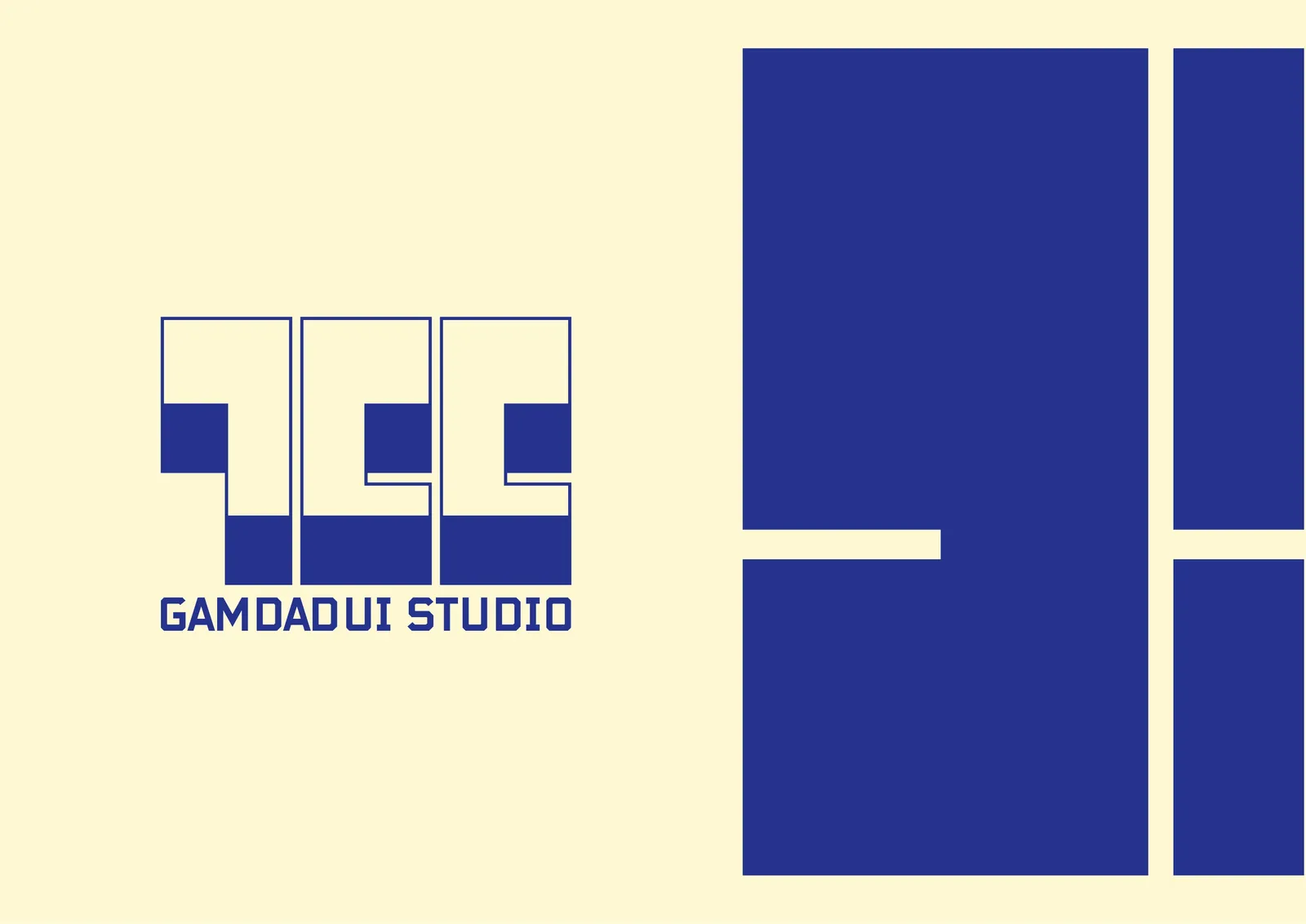
A self-initiated brand identity for Gamdadui Studio, a team in the indie game scene, built around its Korean initials ㄱㄷㄷ.
At a glance
3
Hangul initials, ㄱㄷㄷ, in one mark
5
colours, led by Gamdadui Night Blue
2
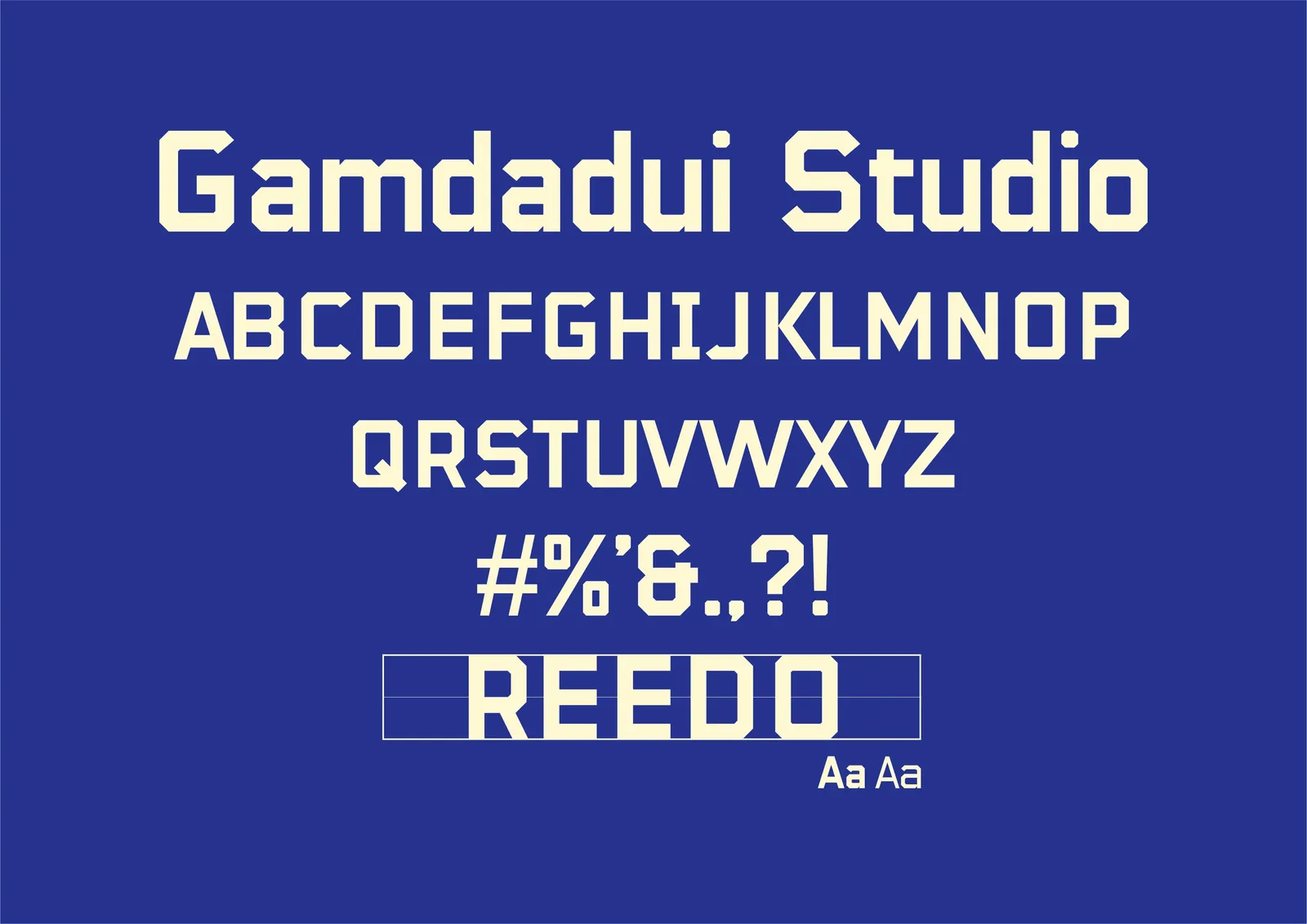
typefaces: Reedo for titles, Noto Sans for content
What we did
- Brand strategy
- Logo & symbol
- Layout & size guide
- Colour system
- Pattern & design elements
- Posters, merch & magazine
The challenge
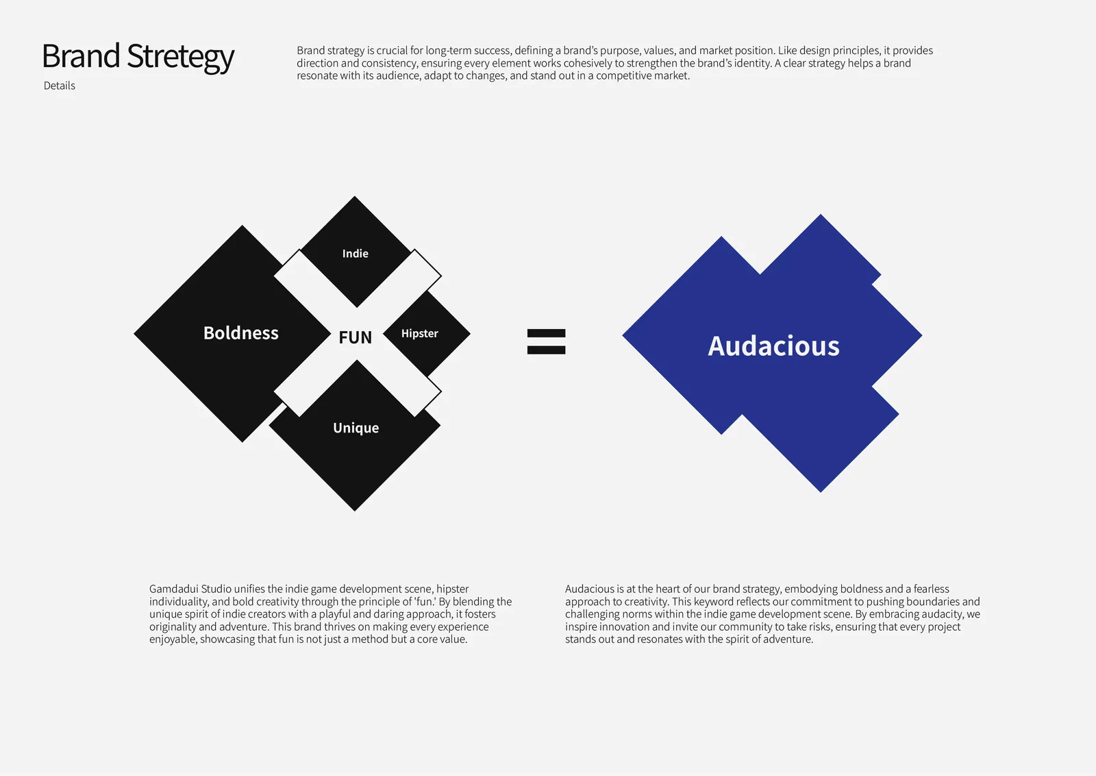
Gamdadui Studio brings the indie game scene, hipster individuality and bold creativity together under one principle: fun.
Its identity had to stand out in a crowded, independent scene, and stay unique, original and refined in everything it touches.
How we helped
- 01
Boiled the strategy down to one word
Boldness, fun, indie spirit, hipster style and uniqueness added up to one keyword: audacious. A fearless approach to creativity that pushes boundaries and invites the studio’s community to take risks.
- 02
Built the logo from the name itself
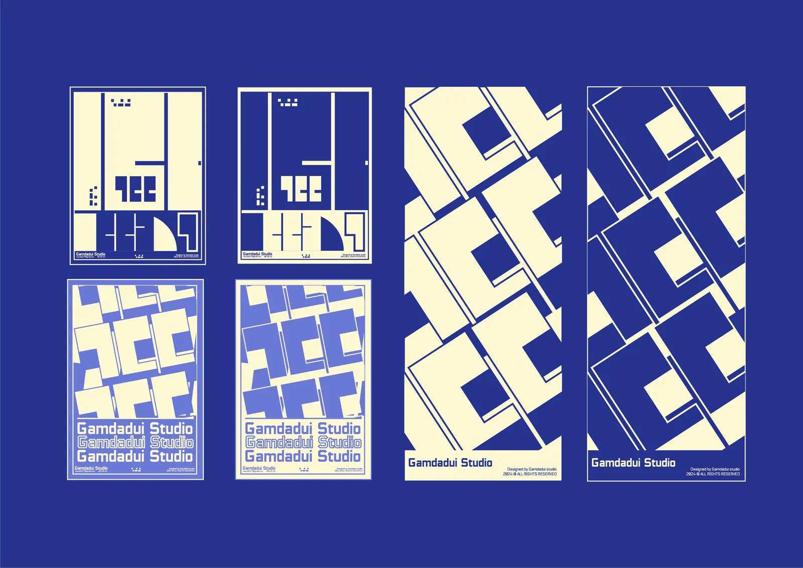
The mark uses the Korean initials ㄱㄷㄷ in bold, angular forms with strong negative space: confident and forward-looking, with room left open for creativity. A layout guide, spacing rules and a 32px minimum size keep it strong at any scale.
- 03
Made a system to play with
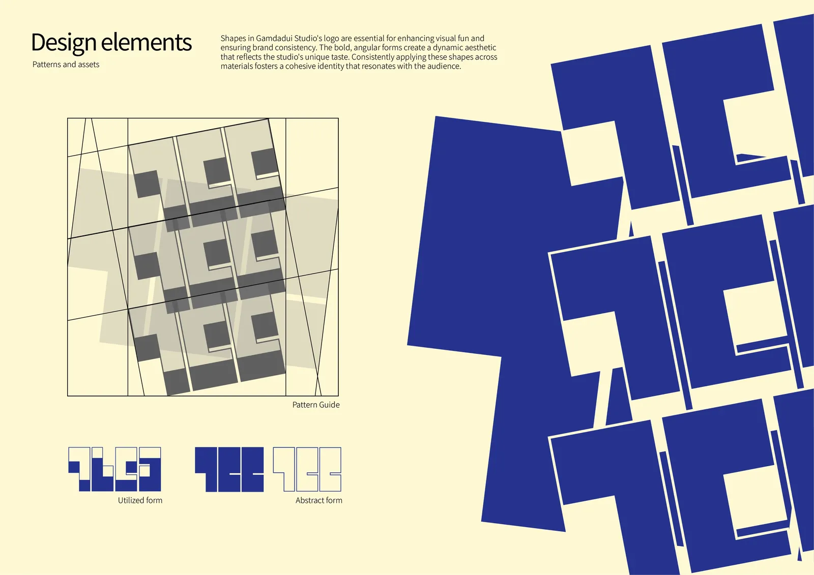
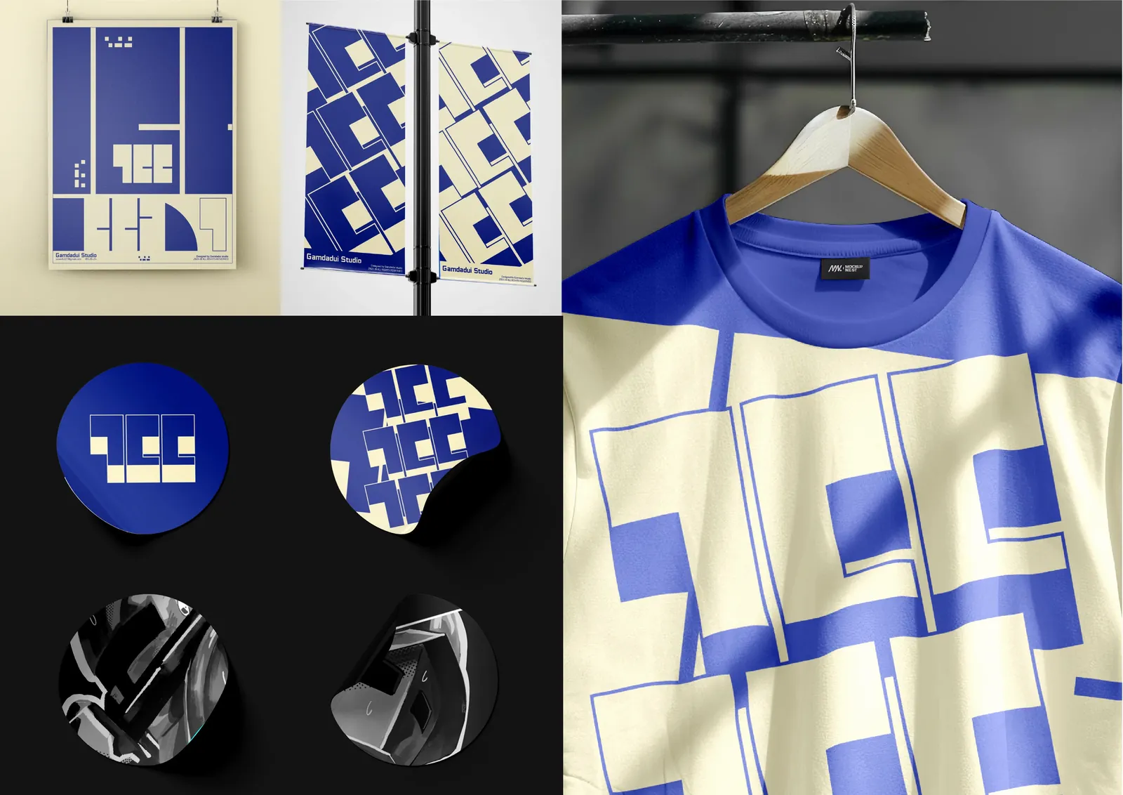
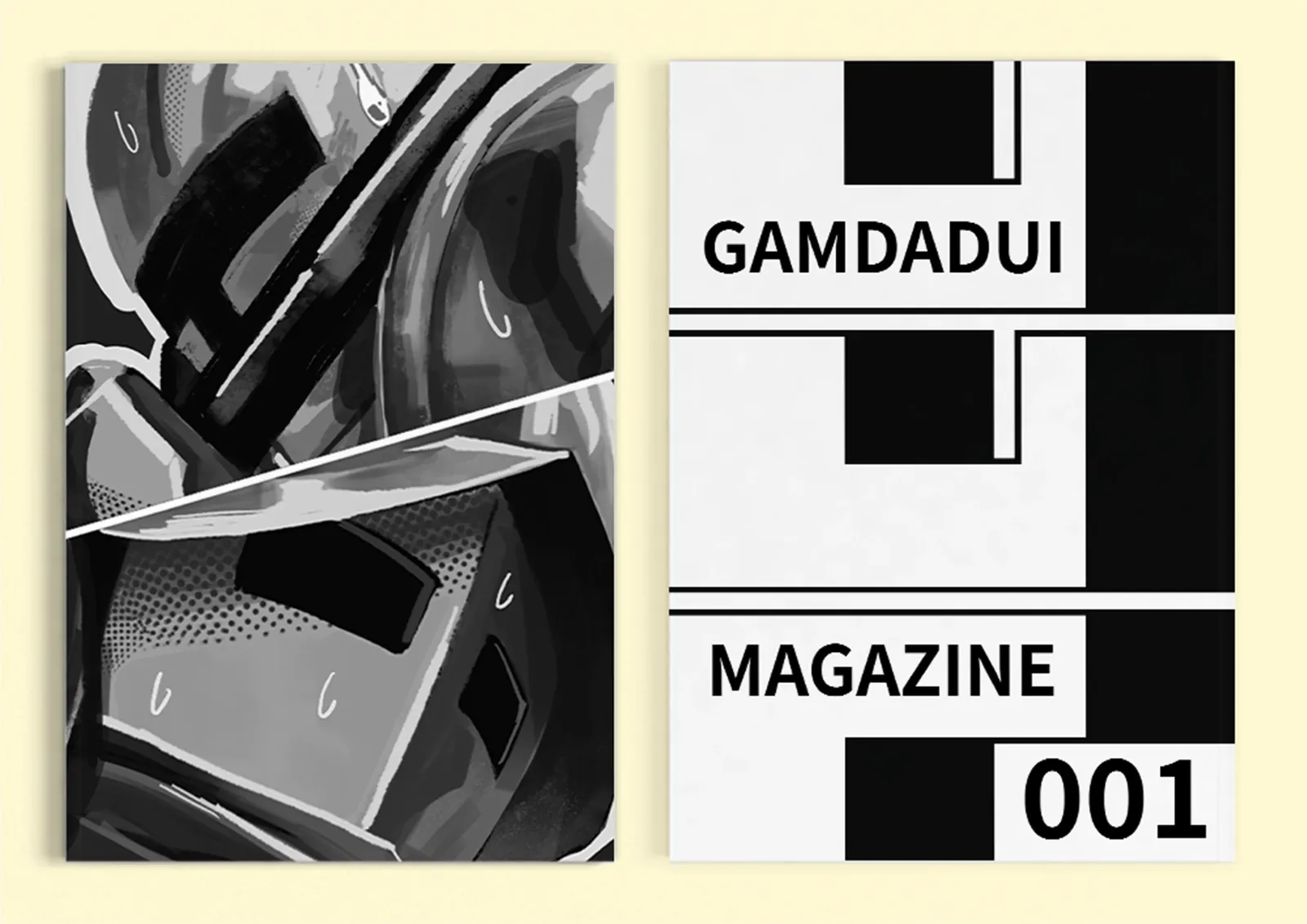
Night Blue, Pan Purple, Night Black, Light Grey and Natural Wool; Reedo for titles with Noto Sans for content; and a pattern of tilted logo shapes that runs from posters and banners to T-shirts, stickers and a studio magazine.
The outcome
An audacious identity with a clear guide behind it: unique, original and refined, and ready to grow with the studio and its community.
Insights
One word to steer every choice.
Five qualities boiled down to “audacious”, and every design decision answers to it.
Build the mark from the name.
The Korean initials ㄱㄷㄷ became the logo, so it could only belong to this studio.
Give people something to play with.
A pattern of tilted logo shapes lets the identity flex from posters to stickers.